%20(1).avif)
The Housing and Migration Crisis
Rising home costs and restricted supply due to increased regulatory constraints have driven economic and societal challenges around housing affordability. Shoag advocates for evidence-based policy reforms to improve mobility and dynamism, including tools to analyze affordability and regulatory impacts, as essential steps to address these challenges and improve housing accessibility.
Readers are asked to make allowances for what was originally an oral presentation delivered on May 8, 2024 at The Austin Symposium. Click here to download it as a PDF.
There is a Jewish teaching that cautions against lecturing in front of people who are wiser, cleverer, or more knowledgeable than oneself, lest you invite embarrassment. Usually, I open my talks with that statement, and then I pause and somberly assess the room, before concluding that it is not a problem!
Today, though, the Austin Symposium lineup—Deirdre McCloskey, Ryan Decker, Ed Glaeser, Ned Phelps, and Cass Sunstein—is a legitimately terrifying act to follow, and this audience is so impressive, that I fear my embarrassment is inevitable. Nevertheless, I am grateful for the opportunity to present because I do feel that housing is an important topic.
The State of the Housing Market
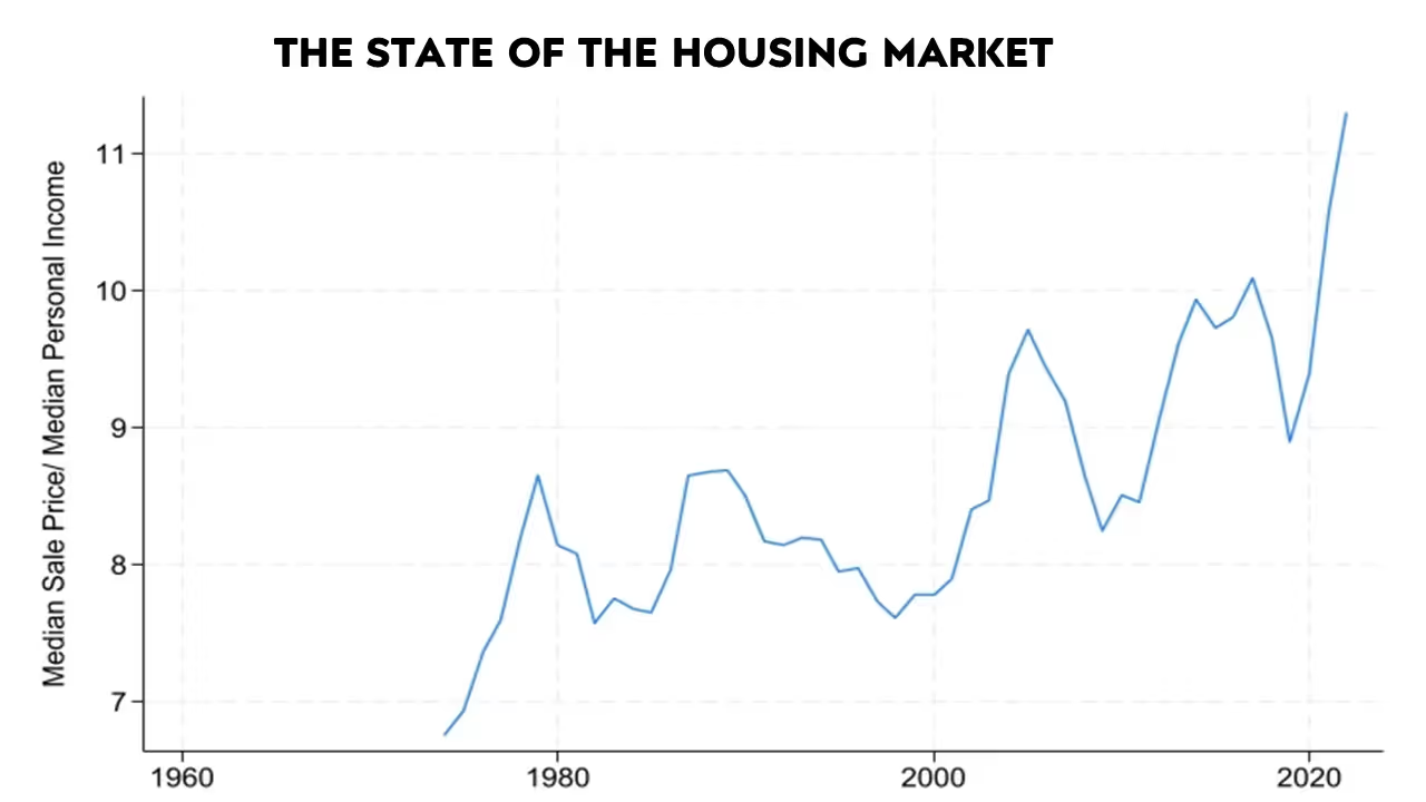
When talking about the state of the housing market, it is not hard to identify affordability as one of the key problems. When comparing the median house price relative to income, the U.S. is close to an all-time high. Looking at the latest data, the median house price is around $420,000.1 Median personal income is just over $42,000.2 The ratio, then, is around ten. That is quite high! Median household income is around $81,000. If you use conventional benchmarks for what the average household can afford, say a house that costs less than three-times annual earnings, the median house is too expensive for around seventy percent of households.3
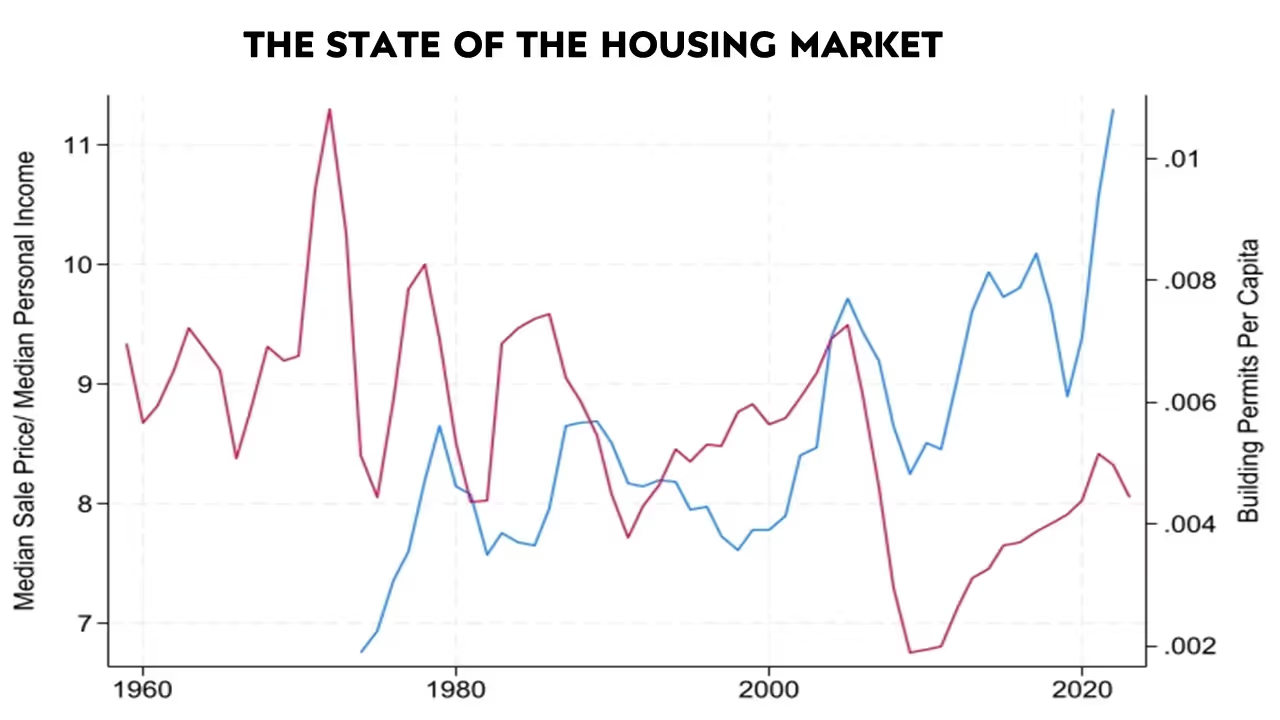
Home prices are becoming genuinely unaffordable. One would assume that, in the face of this spike in prices, the market would increase construction. Higher prices ought to increase supply and ultimately lower costs, but that is not happening. If you look at permits per capita, represented on the chart’s red line, it is relatively low. It’s not quite as low as the recent historical bottom in the 2008 recession, but its far below low per historic patterns.
Why are prices so high? Why aren’t higher prices inducing more supply? Why aren’t we building at the rate that we used to?
Regulatory Constraints: The Cause of the Problem
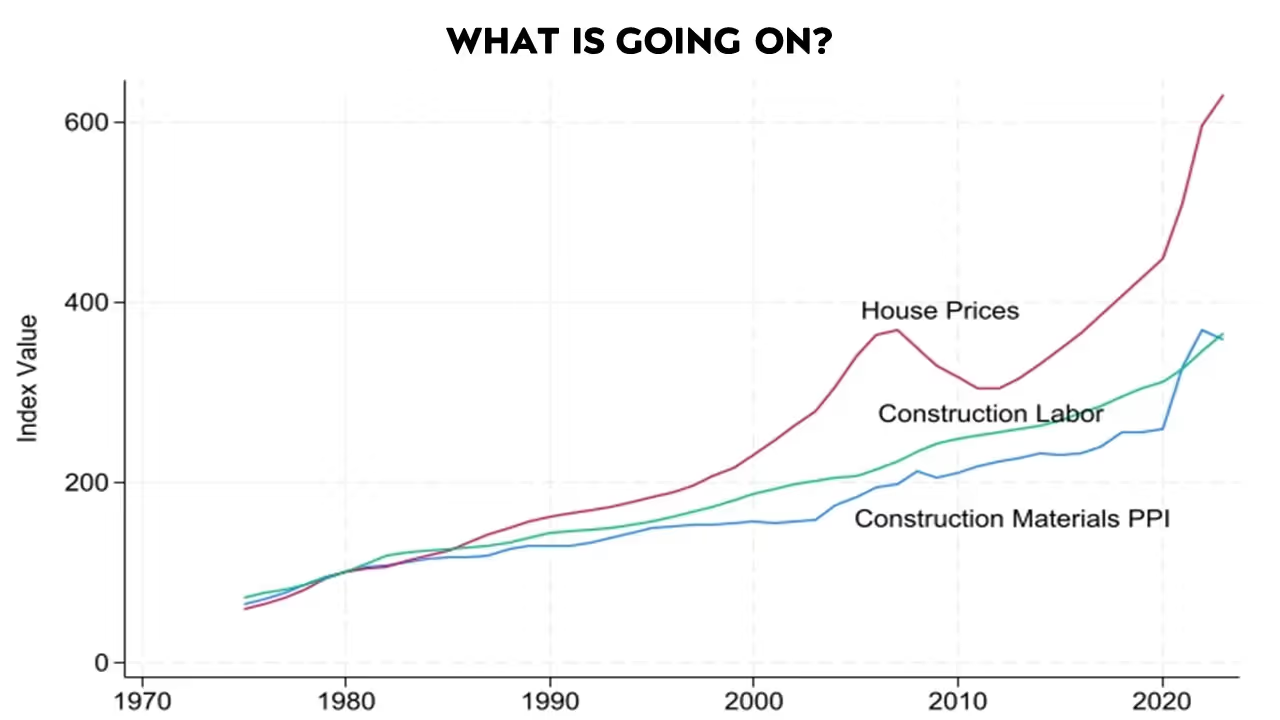
One possibility is rising input costs. If housing prices seem high, we should compare them against relative input costs, using an index of construction labor and construction materials. Those inputs are certainly more expensive overall now than they were in the past, but not expensive enough to explain housing prices. Following Ed Glaeser, we can think of the gap between house prices and how they have grown relative to materials or labor as a regulatory tax.
Non-Regulatory Factors Are Not Driving the Problem
Affordability problems are multi-dimensional. Conventional wisdom attributes these problems to many factors other than regulation, though it is difficult to find convincing evidence that those factors are significant.
Consider, for example, the claim that housing supply may have run up against technological limitations. This claim is difficult to reconcile with the wide range of permitting per capita we see across cities. Right here in Austin, for example, permitting per capita is more than eight times the level of permitting in San Francisco. That is despite the two cities’ similar ratio of single- and multi-family housing.4 It is hard to imagine any type of technological or resource difference that could explain this gap in ability across places. The lack of supply is testament to the regulations, not some fundamental inability to build.
Another myth you often hear is that you are talking about luxury housing or market rate construction, but these factors do not really affect affordability. As data has improved, economists have been able to show in ever more convincing ways that segments of the housing market are indeed connected via prices. Increased supply in one segment passes through the entire distribution of homes.
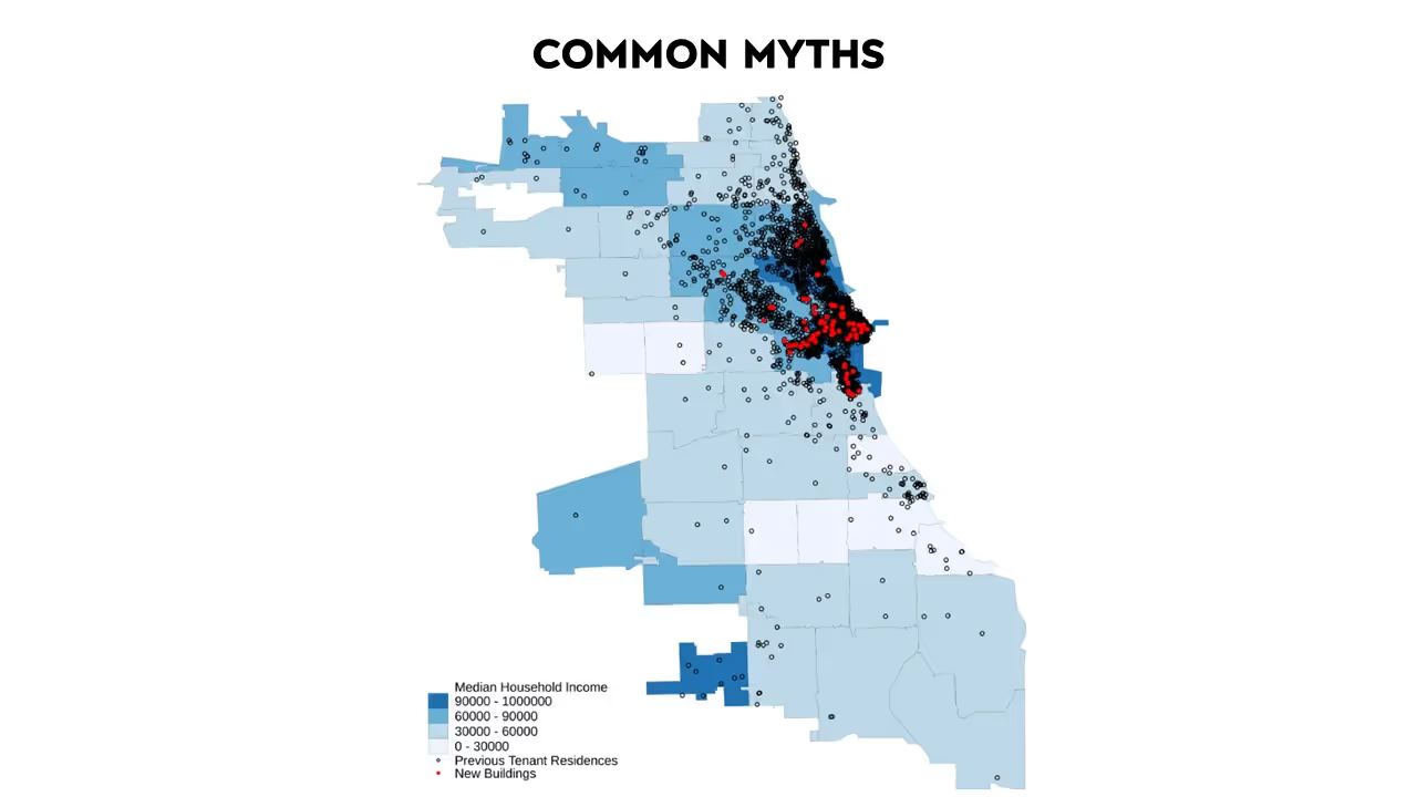
This is from a paper by Evan Mast. It shows the process called filtering—the process by which new construction filters down the demand chain. What is happening here? The red dots are newly built units. But the people who move into those units moved from somewhere else, and someone new moves into the homes that they vacated, and so on. Building one hundred market rate housing units leads to approximately forty-five to seventy people moving out of below median income tracts. Importantly, Mast did not calculate these numbers from statistics; he tracked moves by individual people around the Chicago area. With this incredible data, he could measure how quickly increased “market rate” supply “loosens the housing market in low- and middle-income areas”. Following individual movers, he found most of the effect occurs within three years.
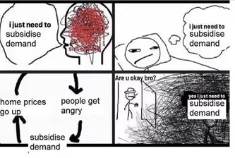
Perhaps more generous demand subsidies would solve the problem? Despite the frequency with which policymakers turn to this option, economic theory suggests it will be ineffective. When supply is inelastic, increasing demand mostly translates into even higher prices. Studies from Peter Ganong and Rob Collison have looked at increasing the generosity of vouchers and other programs. A great deal of increased generosity translates into higher prices, not greater quantity. Other economists have looked at other government subsidies, like LIHTC and tax credits to build low-income housing. Stuart Rosenthal’s papers show that subsidies usually just crowd out non-subsidized, low-income housing production without significantly increasing quantity.
Maybe housing’s inflated cost is due to Airbnb, institutional investors, or foreign buyers. There's research on all these explanations, but when you examine the data, they really do not track. Paper after paper show that regulations restrict supply.
A paper by Ed Pinto and Tobias Peters, where they use visualizations instead of statistical data to show how zoning regulations affect housing, clearly illustrates an example of regulatory impact.
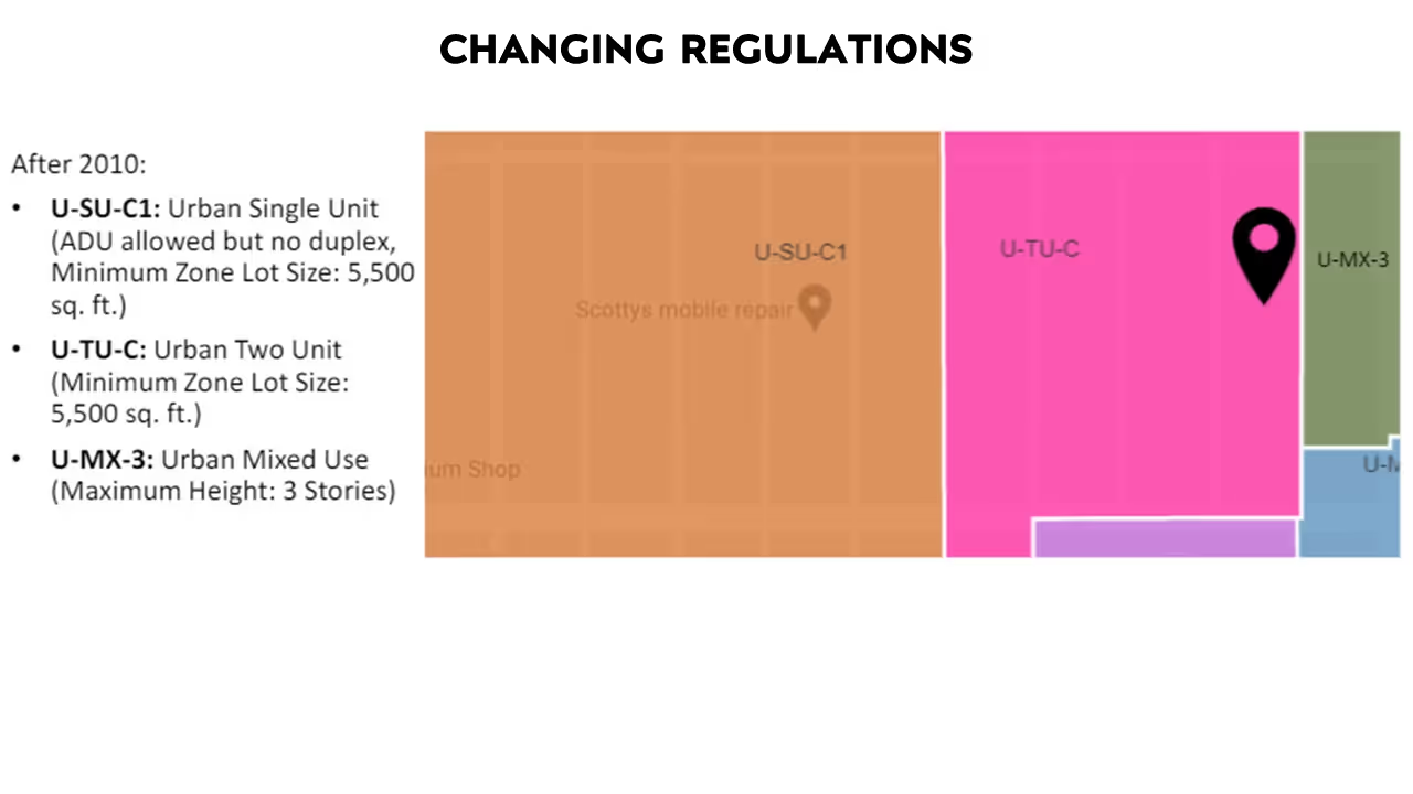
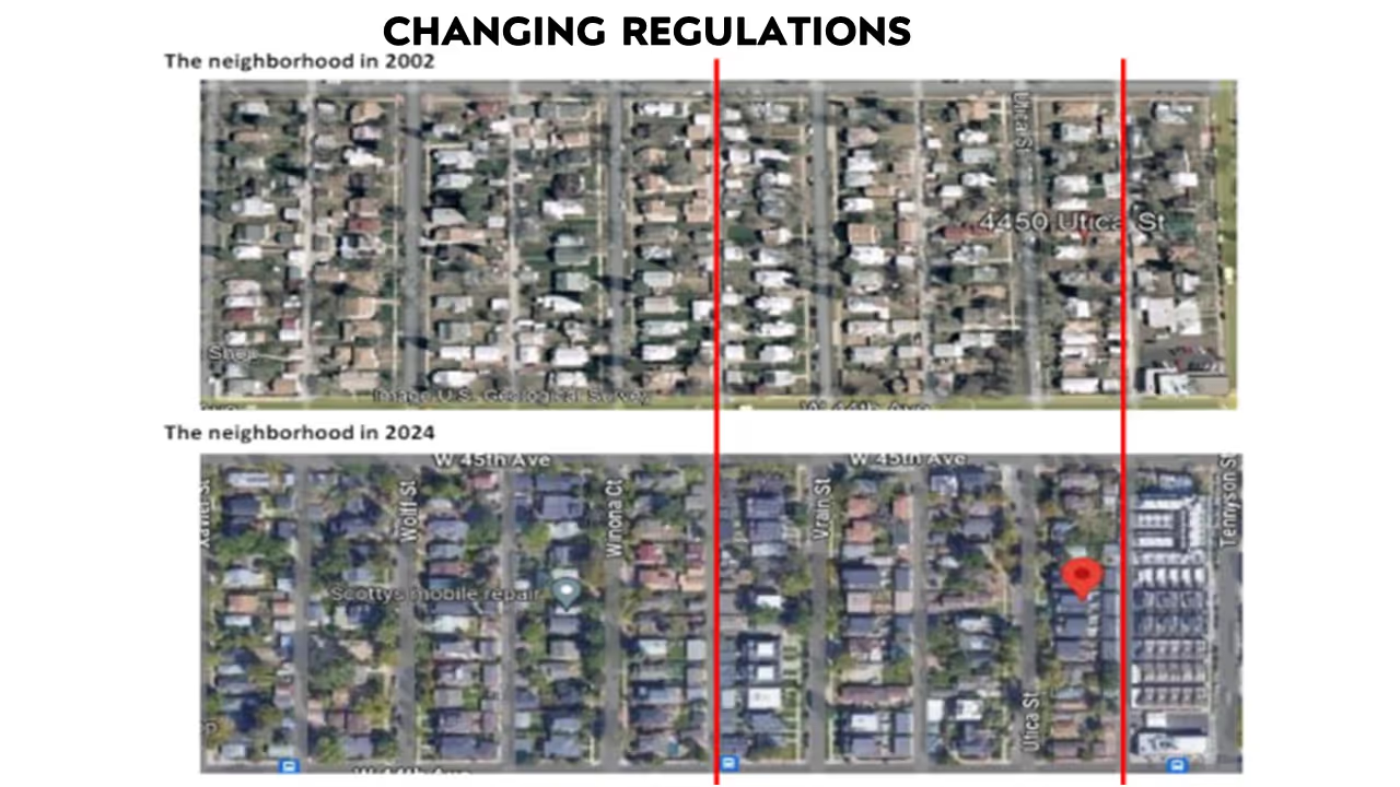
They present two maps from a neighborhood north of Denver that underwent up-zoning in 2010. In this neighborhood, the city divided previously homogenous areas into different zoning categories. The area marked in orange remained zoned for single-family homes, while the pink area was zoned for duplexes, and the green area for three-story townhouses. This area was experiencing significant growth, so the city up-zoned it to allow denser housing.
Here’s what happened: In the orange zone, which remained single-family, the housing count stayed roughly the same, at about one hundred units before and after the zoning change. In the pink zone, which allowed duplexes, units increased from eighty to ninety. In the green townhouse zone, units rose from fifteen to sixty.
This example shows how zoning can either limit or expand housing supply, especially in high-demand areas. By increasing the allowed density, the city was able to provide more housing options, addressing demand in a way that would be impossible if all zones remained single-family.
Housing and Dynamism
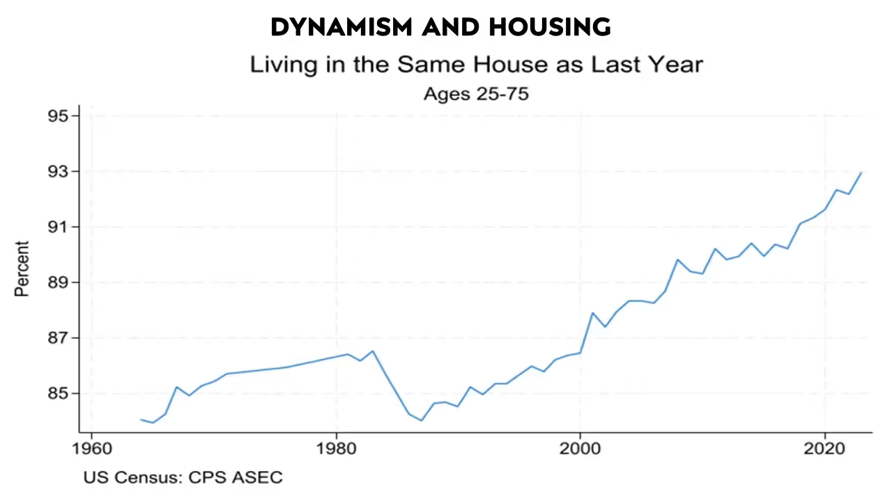
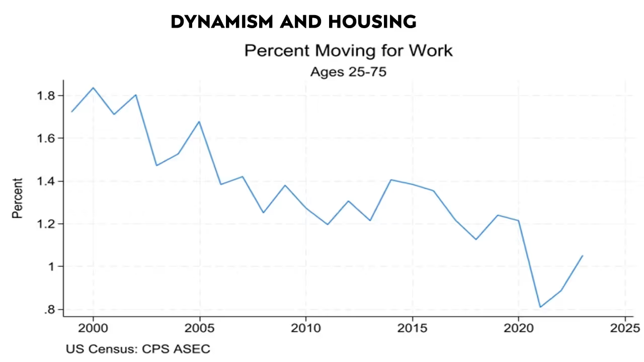
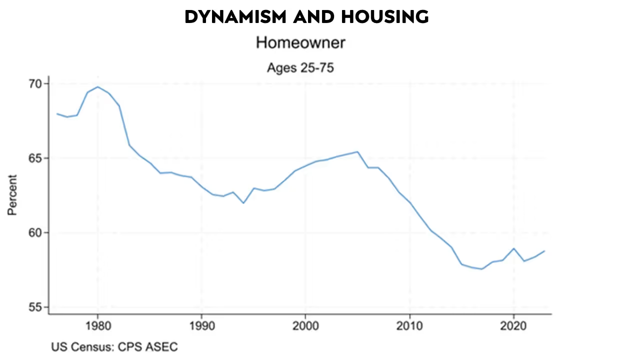
The housing market is closely linked to economic dynamism. Barriers to housing supply directly affect mobility, with people moving less frequently now than in previous decades. Measuring mobility isn’t straightforward, but one approach is to look at immobility—how many people are staying in the same home year after year. This figure continues to rise.
Work-related moves provide another lens on mobility. The Terner Center Project surveys people about what prompts their moves, and three of the main reasons cited are work-related. Yet the number of people who stay put has increased consistently, with many adults now living with their parents. Homeownership and household formation rates have declined.
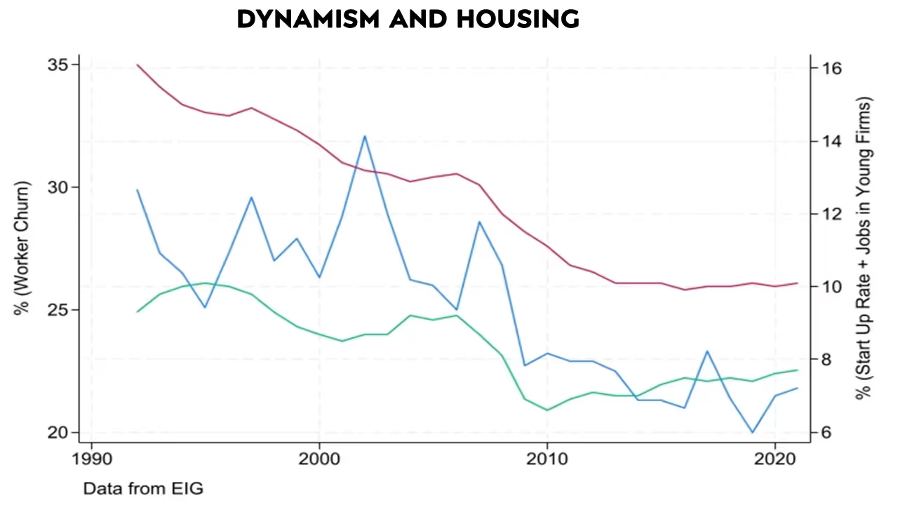
Does physical mobility connect to broader economic dynamism? The Economic Innovation Group (E.I.G.) has developed several quantitative indices to measure economic dynamics, including worker churn, startup rates, the percentage of workers in young firms, and firm growth. Each of these metrics has declined in recent years. Notably, correlations between housing permits and these indices exceed sixty percent—quite high, given just fifty data points—suggesting that restrictive housing markets go hand in hand with reduced economic mobility.
Housing restrictions influence other societal factors as well. Enrico Moretti’s research links housing misallocation to G.D.P. losses, while Ed Glaeser’s work connects housing constraints with increased commuting distances and carbon emissions. Housing costs are even linked to obesity and to marriage patterns—declines in marriage rates and “marriage lock,” where people remain married because high housing costs make divorce unaffordable. In my own research with Lauren Russell, we explore the connection between restricted housing supply and declining fertility rates.
.avif)
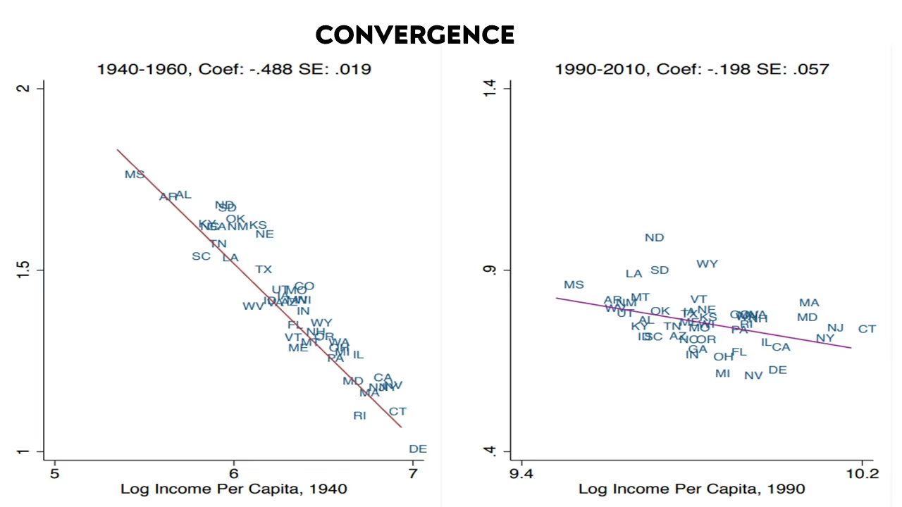
Moving beyond local affects, we see that housing regulations also affect national economic patterns. Consider the concept of convergence, where poorer states historically grew faster than richer ones, gradually closing the income gap.
On this graph, I have plotted income per capita starting over a twenty-year period from 1940 to 1960. On the right are the rich states, including Connecticut and Delaware. And the lower income states are on the left, Alabama, South Carolina, and so forth. On the y-axis, I have plotted growth, meaning how quickly incomes are growing.
You can see that growth is high across the board. The richer states are growing more slowly than lower income states: the lower income states are growing faster in terms of income per capita. What does that mean? The lower income states started off behind and now they are catching up—converging—with richer states.
This is over twenty years, but we have data all the way back to 1880. If you looked from 1880-1980, you would see this relationship. This is a very good relationship for a non-tautological relationship. Across state relationships, the R-squared is 0.95, which means even if you took handfuls of states, you would still see the same relationship.
In more recent periods, however, the relationship is has mostly disappeared. Not only is the slope much weaker, catch up among states has decreased. On this slide, where you can see growth rates and income per capita, the rich states are on the right and the lower income states on the left. It shows a bit of a negative relationship, but it is still possible to find a rich state like Massachusetts and a lower income state like Wyoming that are growing at about the same rate, but the R-squared is lower. The “catch-up” speed is just much slower than it was in the past.
These years are not cherry picked. I have plotted this steep slope in red and this weaker slope in pink. I can do this for each twenty-year window. Here is the steep slope, which is sharply negative for 1940-1960. And here is the much weaker pink slope that I estimated more recently. There is a period where these catch-up slopes were large. Then in more recent periods that slope has gotten much weaker.
.avif)
That is not the only relationship. Here, the x-axis is the same as before. Again, we are looking at the rich states on the right, and the lower income states on the left, but now instead of plotting growth rates in income, I am plotting growth rates in population. I call this relationship directed migration. What we see that a handful of states are growing very quickly in terms of population in 1940-1960. But even in states like Delaware, Maryland, Connecticut, and Michigan, which have relatively high incomes, their population is growing faster than the lower income states; people are moving to states that have the highest incomes during this period.
Now, if we look at a more recent period that relationship is almost gone. Looking at these past graphs, one wonders why they showed income growing the fastest in lower income states. That does not seem to correlate with our recent experience. If we think, moreover, about the parts of the country that are currently growing the fastest, we do not assume that they are these rich states on the graph’s right side, because that no longer holds. The richest states are not growing the fastest. Let us look now at not just for these twenty-year windows, but for all twenty-year windows. We will take this red slope and this pink slope and show the relationship over time.
.avif)
This is directed migration where people are moving to the richest parts of the country. Here is where we were in the more recent period where that is not happening. We have divided postwar U.S. history into two periods: a period where people are moving to the richest parts of the country, convergence happens, and the poor states catch up to the rich states. Then in the more recent period, both of those trends slow, or even disappear. And the question is, why? This paper links these trends to a change in the way we build or the change in housing prices and regulations.
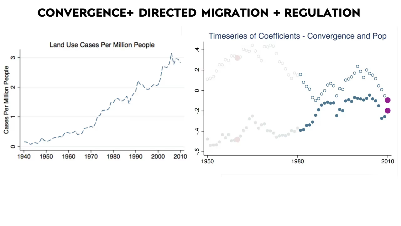
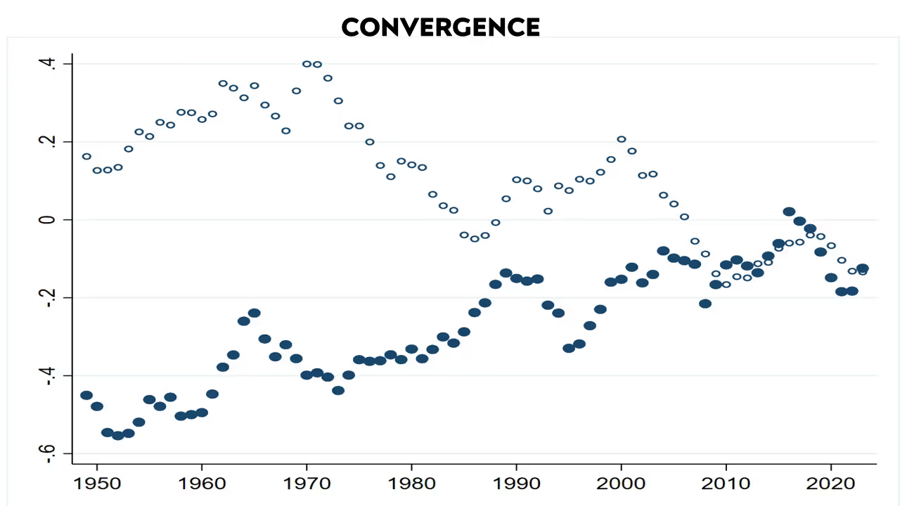
Looking right around this period, where the trends shift, there is a regime change. Work by Bob Ellickson and Bill Fischel looks at court fights about land use and zoning, where they talk about a kind of revolution and the restrictions that emerge over this time period. And the paper traces through how housing prices generate this trend change. What was going on in these two different periods in U.S. history postwar? What we are trying to do is relate this idea of directed migration—people moving to the richest parts of the country—to this idea of convergence. How could those two trends be related?
Think about a state with high wages and scarce labor. Then think about another state where wages are low. There are big returns for both high and low skilled workers if they move to the states with high wages and scarce labor. That migration should equilibrate levels. If you have one place with high skill levels, and one place where people have less education, and people can move around, you'll get convergence. If you have one pot of hot water, one pot of cold water, and people are free to move around, both pots converge towards each other. Directed migration could have been an important part of generating this convergence story. Then what happens when we stop building in the country’s rich, productive areas? What happens when this regime of land use regulations starts restricting supply?
.avif)
When building is restricted, housing prices start to become more important. That changes the return people receive from living in the country’s richest regions. This chart shows commuting zones rather than states. Notice the average wages for those who went to college and those who did not in the 1970s. When you take the average wage and the commuting zone and you take the wage minus housing costs, both those who went to college and those who did not had higher wages after housing costs when they moved to richer areas.
If a bartender in Georgia is making $9/hour he can move to San Francisco and significantly increase his income by making $14/hour. As we stop building in the country’s richest parts, however, the housing costs start to edge out the return for lower education workers. A bartender can make more in San Francisco versus Georgia, but not enough to pay the rent gap between those places.
By 2019, we still have average income across commuting zones: the richest commuting zones still offer higher wages after housing costs for college educated workers. But for non college educated workers, those returns are negative. It does not make sense to go from $9/hour to $14/hour by moving from Georgia to San Francisco because the rent increase mitigates the economic incentive. It turns out that even the wage gains for less skilled workers in these rich communities have decreased, never mind the housing costs.
What then is the problem with moving from a world where everyone—both high and low skilled workers—are moving to the richest parts of the country, to a world where moving only makes sense for high skilled workers? In our current world, it makes more sense for low skilled workers to move away from the richest areas. The result is what we see: there's huge disparity across U.S. states in all sorts of areas, not just productivity, but life expectancy, crime, obesity rates, and mobility. This is a serious challenge to dynamism.
Improving Dynamism: Connecting Research and Policy
.avif)
I have been talking a lot about this growing problem of restricting supply. There has been a growing recognition of this problem in the policy world, and important reforms are underway. Austin is a leader on that front; there have been large reductions in parking requirements in Austin. Cities require builders to provide a certain number of parking spaces alongside every new project. The number in some places including Austin, Minneapolis, and Montana has decreased and required reduced lot sizes, but there is still much more to do.
One way the research community can help is by creating tools that translate academic work on housing for use in policymaking. Now, I will discuss three sets of tools I have been working on to try and make that happen.
.avif)
.avif)
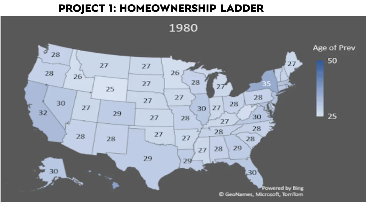
The first slide is the homeownership ladder, which looks at the age at which more than half of people own their homes. This is the age of prevalence. So around what age would you expect the median person to own their home? In 1980, at age 29, half of Texans owned their own home. By 2000, in Texas, that age is 34. By 2021, it's 37. And Texas is nowhere near the worst example. In California, the median age is 49 years old.
People recognize that this is happening. But is buying or not buying a home a policy issue? People are marrying later, they are staying the school longer, and they are having fewer children. Interest rates and financial considerations may plat a larger role in this major investment than we are considering. Should policymakers be worried about this? Is this entirely endogenous? How much are rising housing prices really causing this?
Economists measure the home ownership ladder as going from being a non owner to owning a home to owning a home free and clear. Not everyone follows the ladder, but it is the modal measurement. Instead of looking just at a home ownership ladder, we can think about an affordability ladder. Does one have the net worth to own a home? Do you have the net worth to own a home free and clear? Your personal decision to buy a home or not could depend on whether you decided to have kids and so forth but having the net worth to buy a home seems like an unambiguously good thing.
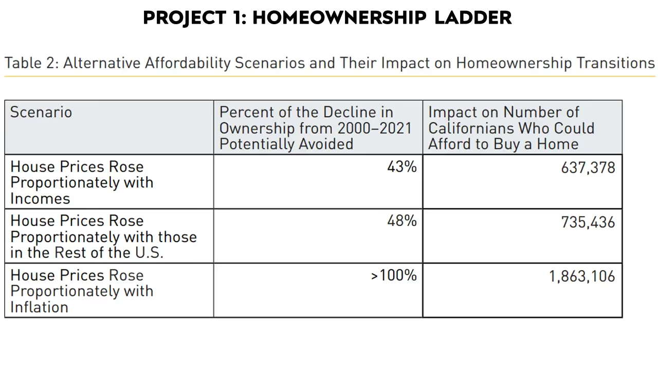
It is difficult to make causal statements about counterfactuals, such as how many more people would own a home if housing prices had played out differently, but the net worth calculator helps us bypass this problem. You can ask about somewhere like California, for example, where if housing prices had only risen proportionately with inflation, or proportionally with the rest of the United States, how much of the decline in home ownership affordability could we have avoided?
When thinking about whether a home is affordable, one must account for the traditional metric of cost burden. According to H.U.D., your cost burden is too high if you spend more than thirty percent of your income on housing. This is obviously imprecise. This assumption comes out of legislation, no economic arguments back it up, and it leads to crazy interpretations. An East Cleveland home is not unaffordable, merely because the people who live there spend more than thirty percent of their income on it. The recommendation ignores normal English by claiming that such properties are unaffordable and classifying them as cost burdens, even though they would classify Kim and Kanye’s house as completely affordable because it costs far less than thirty percent of their income.
This problem arises because we are defining cost burden based on many different sorts of selection. It is true that the homes of people who buy in Beverly Hills might not be at a cost burden to them, but those buyers are heavily selected. People with normal incomes do not live there. We need a measure of affordability that undoes that selection. Selection has even another dimension: how large is the house your money gets you? It may be true that in San Francisco’s Mission District, you can buy a studio for around $600,000. With that somewhat low average sale price, however, you get an unreasonably small property. How can we account for this selection?
.avif)
Another one of my projects with the Terner Center Project in California is building a tool for a selection-robust version of affordability. By clicking the link, for example, you can select Los Angeles County. What percent of all Californians, or all Californians 18-34, or all college graduates could afford to rent in L.A.?
How do we produce these numbers? First, take a target population. Based on family size you can calculate the size of the home they would need to buy, the prices in the target location, and then project wages based on the target location’s wage premium. Then you can produce measures of affordability not just for people who currently live in Beverly Hills where it may look affordable because of the people who live there but based on counterfactual populations. You can calculate how affordable Beverly Hills is, not just for Kim and Kanye, but for everyone—all Californians or all Americans or all college graduates. When you are thinking about finding measures of affordability, building tools like this can be helpful for policymakers, as opposed to trying to use conventional, somewhat misleading tools.
The last project I want to talk to you about is how we can take academic work on regulations and create concrete tie-ins to development. Sometimes researchers invent measures of regulation, like land use cases, that are not helpful. Measuring regulation in this way means nothing to a developer who thinks in terms of floor area ratio, parking requirements, setbacks, maximum height, etc. Academic researchers often take regressions of individual rules and look at statistical relationships between them. That is not always helpful because there are many kinds of complicated interactions between them. Increasing a building’s maximum height requirement without changing the floor to area ratio means that the original change will have no effect. Or changing the floor area ratio but make the change in a location where there is little demand could also have no effect.
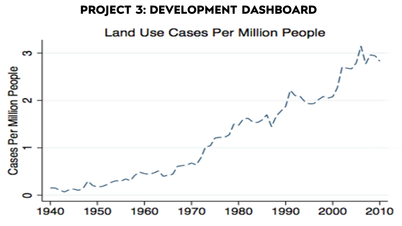
The relationship between all these different rules is nonlinear and interdependent. The results of changing them piecemeal are situations where you change one regulation and expect everything to improve, but it turns out it was the other regulation that was binding. This happened in Minneapolis. What can you do with this? Developers are putting these regulations into a pro-forma profitability analysis. When developers are trying to decide whether to build, they map out how much rent to expect, what development costs will be, how much time it will take to get permits, how many parking spaces they will have to provide, maximum height requirements, where curb cut-outs will be, etc. I have been working with the Terner Center to take a parcel-by-parcel, pro-forma profitability analysis based on factors like how many parking spaces per unit a new development will need or how long it will take to get a permit.
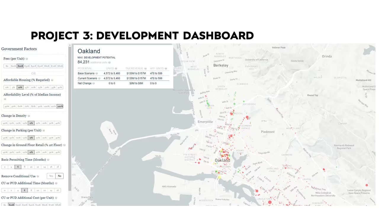
For each parcel in San Francisco or in Los Angeles, for example, you can figure out whether it will be profitable to build or redevelop one unit, two units, three units, or four units, and what is legal to build based on the restrictions. The tool calculates a probability that developers will decide to build in that area. You can make this calculation historically. You can choose a parcel in 2010, for example, and see whether this kind of profitability analysis forecasts over the last ten years. It does. It’s not surprising, because people like to make profits.
What can you do with this data? Well, now you can analyze changing regulations, not in some broad statistical average—reducing the number of parking spaces, for example, in some unhelpful average where sometimes it matters and sometimes it does not—but at a personal-by-personal level and work through all these different interactions.
This is the sort of information that could positively affect policy. In California, cities must submit housing elements that are supposed to meet their regional housing need requirements. This opened a certain number of plots for development. But not every plot has the same likelihood to open for development. You could imagine framing legislation in terms of expected number of new units.
When you think about a cost burden and affordability, you think about area median income. You think about standards for median income or low income in Santa Clara County, where median income is $181,000. That means you can be a family of four making well over $100,000 and be in the low-income bracket. That is not wrong if you are taking a cost burden approach, but we might want to think about having these other dimensions of definitions.
This kind of work can affect policy, and researchers are doing interesting and important work that could feed into this. There is a large project in the works to try to use A.I. or machine learning—text parsing—to look through zoning codes to develop broader datasets than those we have been able to get just with survey data. One of the projects I am working on currently looks at these widely used economic impact models which are based on input-output frameworks, trying to project effects. It is very theory oriented as opposed to based on data.
There is a lot that we can do in that area. The reason I spent a good part of my time talking about this is I think this can be the kind of information that can nicely bridge academia and policy. There is a movement that is interested in working on this problem. Going from a purely academic paper to a clickable tool that that you could use to forecast development or measure affordability is the kind of project where you can really get value outside of traditional academic department work.
Dan Shoag is an Associate Professor in Weatherhead School of Management's Department of Economics at Case Western Reserve University.
---
1 | https://fred.stlouisfed.org/series/MSPUS
2 | https://fred.stlouisfed.org/series/MEPAINUSA646N
3 | https://dqydj.com/household-income-percentile-calculator/
4 | https://www.apartmentlist.com/research/which-metros-are-permitting-new-homes-the-fastest
Download as PDF
This paper was originally delivered as oral remarks during the 2024 Austin Symposium on Economic Dynamism
Economic Dynamism
.jpg)
London and the Architecture of Creative Growth
Preserving London's creative dynamism will require humility from policymakers and a commitment to keeping the city liveable.

Do Dynamic Societies Leave Workers Behind Economically?
We need a more dynamic economy that can help workers by allowing them to move where they can best use their skills.
.webp)
The Tragedy of Paul Ehrlich
In Ehrlich's view of the world, every new person is just a stomach and a pair of hands.

Cut Licensing, Cut Prices, Embrace AI
There’s a quiet and much more practical reform that could win support from both sides and truly bring down prices: occupational licensing.


.jpg)


.jpg)


